0
1
2
3
A
B
C
D
E
F
G
H
I
J
K
L
M
N
O
P
Q
R
S
T
U
V
W
X
Y
Z
Pa
Pe
Ph
Pi
Pl
Po
Pr
Py
Por
Pos
Pow
6 thoughts on “Portrait of a City – Venice”
Leave a comment
You must be logged in to post a comment.


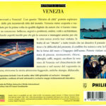
Making a good cultural CD-Rom is not easy.
You need to gather a rich content with a multimedia mix, an attractive design for the interface and make information easily accessible.
Alas, Portrait of a city: Venice, fails on all the charts.
1- the content is quite poor. It’s made of medium to low quality photos presented as multiple slideshows more or less commented by a voiceover.
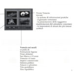
2- The graphic interface is also austere and poorly designed.
3- The navigation is boring without an automatic visit option and with some clicks give only access to 30 seconds voiced shortslideshows.
The few photos of the carnival of Venice are simply ugly (framing, light etc ..), the interactive CD completely missing the subject.
The lack of video and comments make the title boring.
I advice you to avoid this CD-i title !
The title exists also in French
You are right.
I have added it but I still miss the Catalogue number it it.
Hello, catalogue number of French version is 812 0064. Let me know if you need some screenshots.
I have this disc, for me it’s a good program.
Even if some pictures seems to be taken by a bad caméra, in another hand, a lot are pretty great.
You Can see a map where you Can visit more than 100 sites (churchs, shops, restaurants etc..) from Venise and islands all around or you Can follow the main menu where you Can discover the town of Venise last past and nowaday.
Bye.
Thank you Olivier!
If you could make scans of the your French title I will really appreciate (front, rear and CD).
Hello, pictures sent by PM. À+